


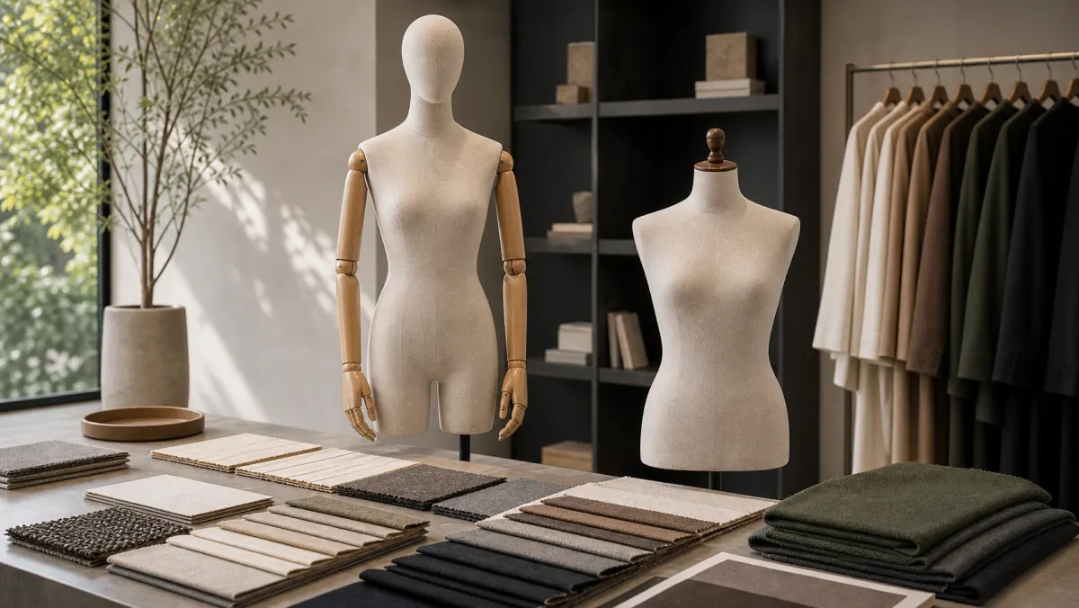
Fabric color matching for custom mannequins should start with the store environment, not only a fabric swatch in isolation. Boutique teams need to check how the chosen textile color works with garment palettes, wall finishes, flooring, display props, lighting temperature, and the brand’s desired level of contrast. A warm ivory mannequin can soften a luxury display, while stone grey or muted taupe may create a quieter background for seasonal collections. When buying fabric covered mannequins, the safest approval process is to compare swatches under real or simulated store lighting before confirming sample production.
Definition: What Is Fabric Color Matching for Custom Mannequins?
Fabric color matching means selecting a mannequin covering color that supports the store concept, garment presentation, and repeat-order consistency. It is not simply choosing a favorite neutral. The color must sit comfortably beside fashion collections, window backgrounds, display platforms, and other retail display props.
For premium boutiques, fabric color also affects perceived value. A slightly warmer neutral can make garments feel softer and more approachable. A cooler grey can feel architectural and modern. A darker textile can be useful for pale garments but may absorb detail under low lighting.
When one neutral tone cannot suit both garments and interiors, a two-tone fabric mannequin can combine two coordinated colors in one display form.
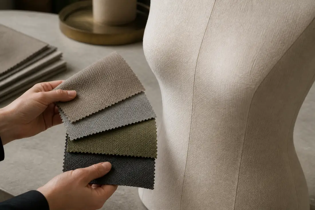
Comparison: Swatch Approval vs Store-Context Approval
| Review Method | What It Checks | Main Risk |
|---|---|---|
| Desk swatch only | Basic color and fabric texture | Color may shift in the actual store |
| Garment contrast test | How light, dark, and patterned garments read against the fabric | One season’s palette may dominate the decision |
| Lighting test | Warm spotlight, daylight, and mixed retail lighting response | Requires more preparation before sample approval |
| Store-material comparison | Coordination with floor, wall, metal, wood, and fixture finishes | May reveal that the first preferred swatch is too strong |
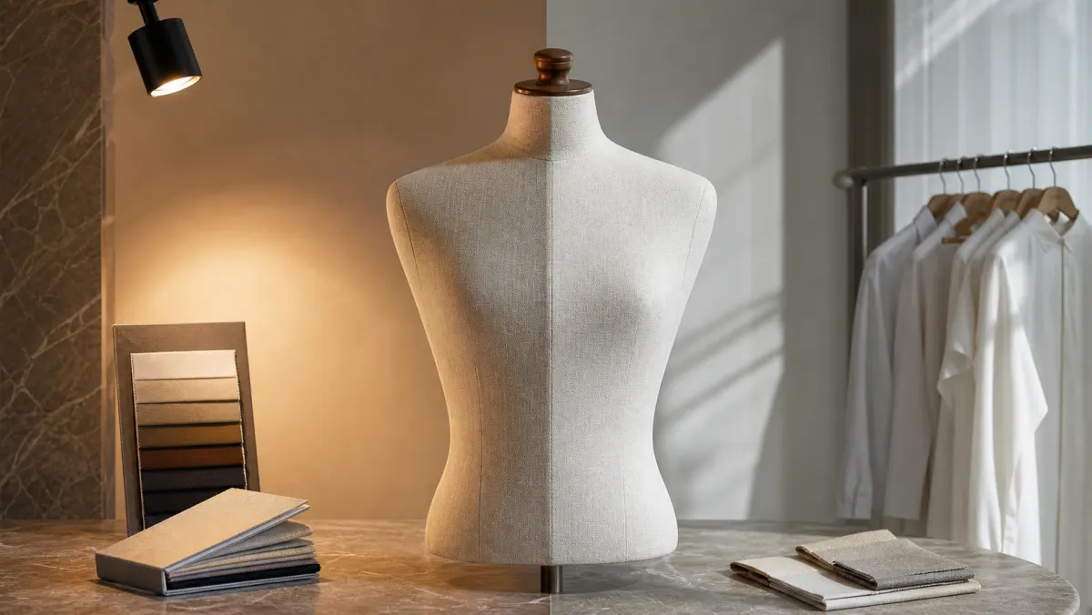
Buyer Checklist
- Collect store finish references, including floor, wall, fixture, metal, stone, and wood tones.
- Compare fabric swatches with both light and dark garments from the planned collection range.
- Check the swatch under warm retail lighting, daylight, and any cooler showroom light that buyers may use.
- Decide whether the mannequin should blend into the environment or create controlled contrast.
- Confirm whether the same color will be used across full-body, torso, and accessory display forms.
- Record approved swatch references and visual notes for repeat orders.
Key Takeaway
The best fabric color is the one that stays useful across garments, lighting, and store materials. For custom mannequins, buyers should treat color matching as part of the sample brief, not a last-minute cosmetic choice. A controlled fabric color decision helps the display feel premium while reducing the risk of visible mismatch across multiple stores.
To discuss a fabric color direction for a boutique or multi-store display project, prepare your garment palette, store material references, and sample approval needs, then contact XINTU for a custom mannequin brief.
Models that lead with a specific fabric color: Red Velvet Female Mannequin, Beige Velvet Head Form with Silver Stand, Purple Velvet Necklace Display Bust, Green Velvet Head and Shoulder Bust